Mastering Tailwind CSS

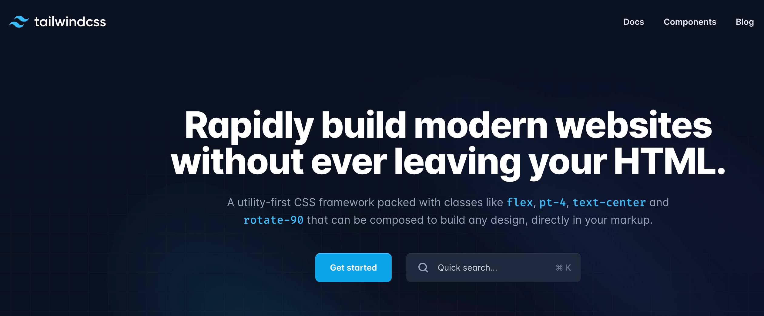
Tailwind CSS is a utility-first CSS framework that takes a different approach compared to traditional frameworks. Instead of providing pre-designed components, Tailwind CSS offers a set of utility classes that you can use to directly style your HTML elements. This utility-first approach allows for rapid development and unparalleled customization possibilities.
Getting Started with Tailwind CSS
Setting up Tailwind CSS is straightforward. You can choose to install it via npm or yarn and include the Tailwind CSS file in your project. Once set up, you can begin using the utility classes right away to style your HTML components.
The Power of Utility Classes
Tailwind CSS boasts an extensive list of utility classes that cover everything from margins, padding, and colors to flexbox, grid layouts, and responsive design. These classes can be combined to create complex layouts and styles without writing custom CSS.
For example, centering a div horizontally and vertically is as simple as:
<div class="flex items-center justify-center h-screen">
  <!-- Content goes here -->
</div>
Customizing Tailwind CSS
Tailwind CSS provides an elegant way to customize the default configuration to match your project’s design requirements. With a configuration file, you can modify colors, fonts, breakpoints, and much more, ensuring a consistent and cohesive design language.
Responsive Design Made Easy
Tailwind CSS makes implementing responsive designs a breeze. By applying responsive utility classes, you can adapt your layout and styles to various screen sizes and devices seamlessly.
<div class="lg:flex lg:items-center">
  <!-- Content goes here -->
</div>
Efficient Workflow and Faster Development
With Tailwind CSS’s utility-first approach, you can rapidly prototype and build interfaces. The framework’s concise and semantic classes enable a more efficient workflow, reducing the time spent on writing custom CSS.
Emphasizing Accessibility
Tailwind CSS prioritizes accessibility, ensuring that your websites are usable and inclusive to all users. By using semantic HTML and proper focus states, you can create an accessible user experience.
Embrace the Dark Mode
Tailwind CSS embraces the popular dark mode trend with built-in dark mode variants. With a simple class addition, you can enable dark mode for your website.
<div class="dark:bg-gray-900">
  <!-- Content goes here -->
</div>
Beyond the Basics: Plugins and Extensions
Tailwind CSS can be extended further through plugins and extensions. These third-party additions provide additional functionality, components, and styles to augment your Tailwind CSS projects. I’ll remove that prefatory text and provide the content that should go after “Beyond the Basics: Plugins and Extensions:”
Beyond the Basics: Plugins and Extensions Tailwind CSS’s functionality can be extended through its robust plugin system. Official and community-created plugins offer additional utilities, components, and features that enhance your development workflow.
Popular plugins include;
@tailwindcss/typography: Provides beautiful typographic defaults for HTML content@tailwindcss/forms: Adds better base styles for form elements@tailwindcss/aspect-ratio: Offers utilities for controlling aspect ratios@tailwindcss/line-clamp: Enables truncating text to a specific number of lines
Example of using the typography plugin
<article class="prose lg:prose-xl">
  <h1>My Blog Post</h1>
  <p>This content will have beautiful typography styling...</p>
</article>
Performance Optimization Tailwind CSS includes built-in optimization features through PurgeCSS integration. This ensures that your production builds only include the utility classes actually used in your project, resulting in minimal CSS file sizes.
// tailwind.config.js
module.exports = {
  purge: [
    './src/**/*.html',
    './src/**/*.js',
  ],
  // ... other configurations
}
Integration with Modern Frameworks Tailwind CSS seamlessly integrates with popular frameworks and build tools:
- React and Next.js integration through PostCSS
- Vue.js and Nuxt.js compatibility
- Angular and Svelte support
- Integration with popular build tools like Vite and webpack
Best Practices and Common Patterns
When working with Tailwind CSS, following certain practices can enhance your development experience;
- Component Extraction: Create reusable components for common patterns
- Using @apply for complex utility combinations
- Maintaining consistent spacing and color schemes
- Leveraging the configuration file for project-specific customization
Example of component extraction:
// Button component
const Button = ({ children }) => (
  <button className="px-4 py-2 bg-blue-500 text-white rounded hover:bg-blue-600
    transition duration-200">
    {children}
  </button>
);
Advanced Features and Techniques
Tailwind CSS offers advanced features for complex scenarios;
- JIT (Just-In-Time) Mode for on-demand utility generation
- Arbitrary value support using square bracket notation
- Multi-theme support through CSS custom properties
- Advanced hover, focus, and other state variants
<div class="bg-[#bada55] hover:scale-[1.23]">
  <!-- Custom values using arbitrary value syntax -->
</div>
Future-Proofing Your Projects
Stay current with Tailwind CSS developments;
- Regular updates and version migrations
- Following the official blog and documentation
- Participating in the community
- Implementing sustainable architecture patterns
Conclusion
Tailwind CSS represents a paradigm shift in web development, offering a powerful and flexible approach to styling. By understanding its core concepts, utilizing its extensive feature set, and leveraging the ecosystem of plugins and extensions, you can create modern, responsive, and maintainable web applications efficiently.
How do you test Svelte components
How do you use Svelte with static site generation
How do you create a real-time chat application with Svelte
How do you use Svelte with WebSockets
How do you create a dynamic form in Svelte
How do you use Svelte with Firebase